Website Planning for Local Governments

Local governments have a long wish list when it comes to websites and no wonder. Businesses can optimize their websites to target a specific customer audience, but state/provincial and municipal websites must address the information needs of residents, prospective residents, tourists, business owners, community partners, and their own staff.
Rather than dive down a rabbit hole of features and technology, local governments can improve cost, efficiency, and focus by using objective data and business goals during website planning. Before you write up a wish list for interactive maps, live notifications, and online payments, here are some tips to help refine your functional requirements.
What do visitors want to know?
If you’ve been using Google Analytics, you already have a lot of valuable data. Google Analytics yields both historical and up-to-the-minute data about how people currently use your website. By examining visitor traffic patterns, it’s possible to optimize navigation and reduce user frustration.
If you want to be responsive to your audience, check out the Analytics stats for your most popular pages to learn which pages should be easier to find.
When New York City planned their new NYC.gov website, they discovered that the most visited pages were for city jobs. This made them put a JOBS tab on the Home page to reduce the number of clicks needed to get to the Jobs section of the website. For other popular pages, they added a highly visible sidebar of 311 links to the most often-viewed services and enquiries, plus another 311 tab on the main menu.
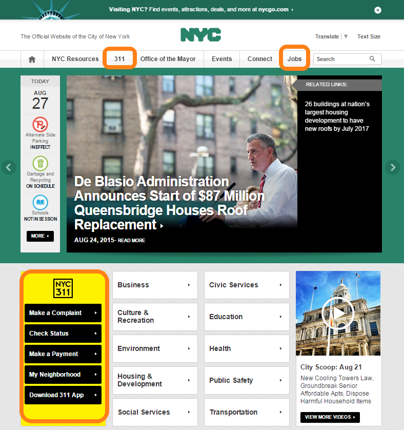
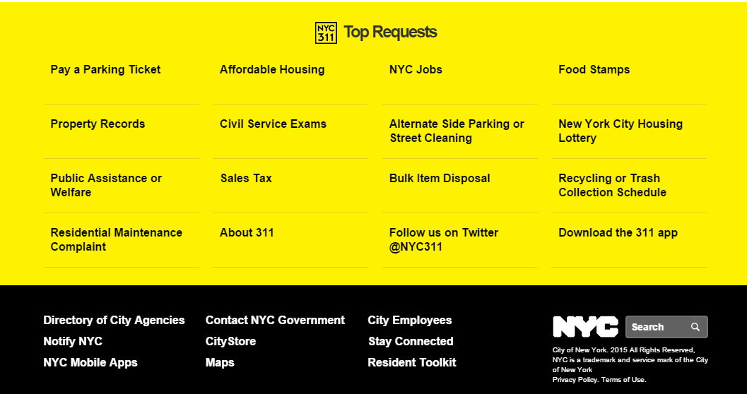
The ‘most popular pages’ theme continues with a footer on every page that displays a more granular list such as: Pay a Parking Ticket, Property Records, and Trash Collection Schedule. The City includes a Download 311 App link on the sidebar and the footer, encouraging residents to interact online with city staff. This is clearly a website optimized to serve New York City residents and improve City staff productivity.
What do visitors want to find?
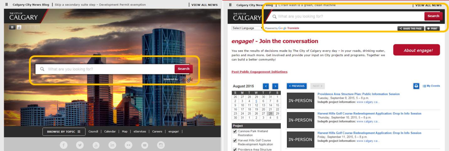
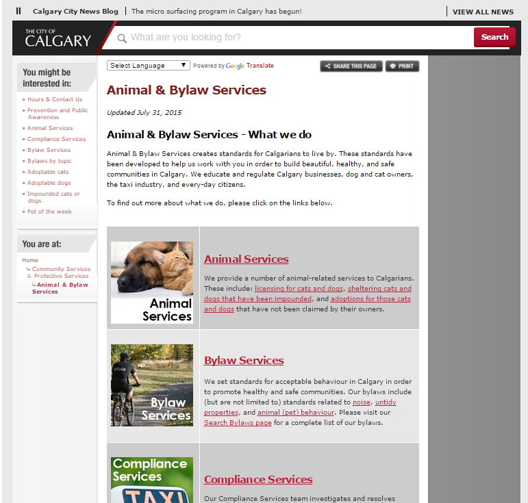
Always provide on-site search. The City of Calgary features a prominent Search field on both its Home page and sub-pages.
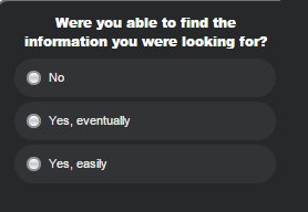
The site also pops up a mini-survey to ask visitors whether they were able to find what they were looking for – a sign that the City is monitoring and tweaking the website to improve information delivery.
If you already have Google on-site search implemented, the Internal Search Reports in Google Analytics will give you plenty of useful data about which search terms visitors are using. Tracking this information provides insights on what visitors expect to find on your website, what terms they search on, and what they’re finding or not finding. This in turn helps you structure an information architecture that better anticipates your audience’s needs.
How much traffic does your social media generate?
Google Analytics’ Traffic Sources Overview summarizes search traffic, referral traffic, direct traffic, and any online campaigns you might be running. These days, it never hurts to check how much traffic is coming to your website via social media (referral) versus organic search (direct and keyword searches). This matters because municipalities are using social media more and more to:
- Inform residents of emergencies or public safety issues
- Promote events, recreational programs, and facilities
- Inform constituents of new bylaws, zoning, and issues
When planning your website, think of it as part of an integrated digital presence. Do more than just include social media icons on your website. Make sure your layout and content drives visitors to Like or Follow your social media accounts.
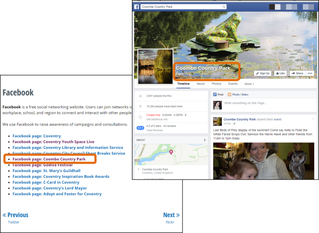
The City of Coventry in the UK manages multiple Facebook pages, each dedicated to an event or cause; this enables them to target specific audiences more effectively. Their website makes these multiple Facebook pages easier to find by creating social media directory pages. It's clear to visitors which social media accounts to follow.
Conversely, in order to drive traffic to your website your social media needs ongoing content to promote. If you want social media to drive more activity to your website but 95% of your web traffic still comes from organic search, you may need to boost your content marketing. Once they click over to your website, visitors should see landing pages that are directly relevant and provide deeper information. There is only so much that design and layout can achieve – content matters.
The City of Calgary has Facebook pages for departments such as: Animal & Bylaw Services, Parks, Arts and Culture. Each of these Facebook pages posts news and advice; some posts link to full articles on the department’s page on the City of Calgary website.


What are your visitor demographics?
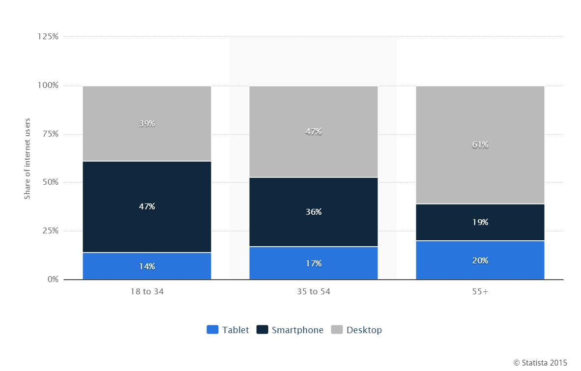
No one denies that responsive design is a must for new websites. Mobile device use of the Internet has exceeded that of desktop PCs. The chart below shows the distribution of time spent on digital devices in Canada as of March 2015, sorted by age. Not surprisingly, the 18 - 34 age group use Smartphones more than tablets or desktop PCs to access the Internet.
But what are the demographics for your community? Who are you trying to serve better? If your surveys show that Baby Boomers are moving into your neighbourhoods, think reading glasses and make sure your web design features pale/white backgrounds, reasonably large fonts, and high contrast text. If your town is popular with retirees, consider adding an intelligent, context sensitive search function so that visitors can type queries in sentence form (“I want to …”) rather than come up with keywords.
Do you have a multicultural community? Is it worth developing a multi-lingual site? A true multi-lingual site is expensive. What the City of Calgary has done is integrate Google Translate.
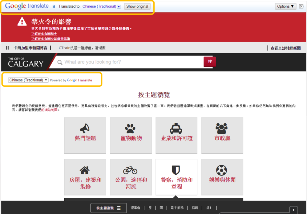
A word of caution: online translation is not perfect, so if you take this route, be sure to state that in case of dispute, the English text is considered legal and valid.
Can you take services online?
As consumers become more accustomed to digital transactions, both citizens and businesses will expect local governments to offer more services online. This requires strategic planning and in some cases, multi-year roll outs. Some common candidates for online service include:
- Parking ticket and toll charge payments
- Construction permits
- Bids for city contracts
- Special event permits
- Police record requests
- Rental permits
Online fulfillment of standard licenses and permits allows city employees to spend more time dealing with more complicated situations. The Oakland County website home page features a large ‘Online Services’ button which leads to a page of all its online services.

The county’s CIO estimates that the website has processed more than $13.8 million in transactions, saving $2.8 million for taxpayers and reducing transaction costs by $1.3 million (see this article).
How does your website support business goals?
Your target audience comprises more than residents. You have business goals and one of those might be to boost the tourism economy. Another could be to bring more employers into the area. Your requirements should address business goals as well as residents’ needs.
The City of London, one of 33 boroughs that make up Greater London, depends on tourism for approximately 10% of its annual revenues and 15% of its jobs. The website uses the ‘most popular’ tactic by offering a list of ‘Most Popular’ pages with emphasis on tourist destinations. Similarly, the Your City section in the centre features festivals, sights, and events.
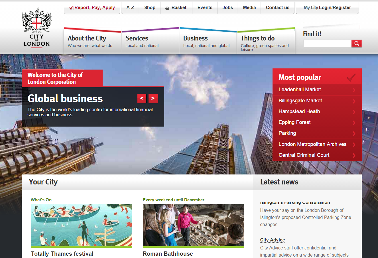
The City of London is also a global financial hub. Its home page manages to address businesses via a menu above the main banner that clearly shows four major information categories: About the City, Services, Business, and Things to Do. All four topics are relevant for companies thinking about a London location.
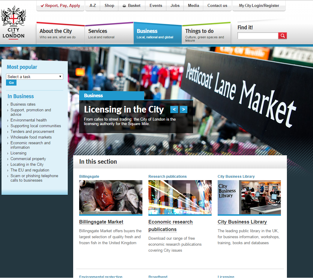
The look of the sub-page for Business is similar to the home page – the only real difference is that the list of ‘Most Popular’ topics is on the left instead of the right. The featured topics in the centre point to business resources. The sub-page is as elaborate as the home page, making it clear that this is not a sub-page but a portal to City of London business information.
Do your content and site administration allow agility?
Content marketing is essential to a successful online presence. This means the tools you use to update your website matter. Unless it’s extremely simple for staff to add, edit, and delete content, it will be hard work keeping your website up to date.
Chances are you’ll be using Drupal or WordPress as the content management system. Both offer WYSIWYG text editing, but much ease of use depends also on the website’s theme. It may not be flexible enough. When content editing/administration is confusing, people get reluctant to make changes in case they make mistakes. Plus, if a process is onerous, they’ll update less frequently
Content isn’t just text. Walk through every element of a design and find out from the developer whether it’s possible to change images, banners, or headlines without going into code. Is there flexibility to select from different template styles? Can site administrators add pages and menu items? Can they format text into columns or set up tabs? It takes a combination of add-on features, user roles, and design, to provide a back end that makes it easy for staff to maintain your website.
In the rush to get a new website online, ease of site and content administration often get overlooked. It’s worthwhile investing in back end design; you’ll gain it back in the form of productivity and an always-fresh website.
In summary
Government websites always provide a lot of helpful information. The sheer volume of information, however, creates a navigation challenge which can lead to frustration and even worse, promote perceptions of an unhelpful bureaucracy. With data analysis and good information architecture, you can avoid such negative impressions and build a friendly site that’s easy to navigate.
Begin by using data in your website planning process. The objective insights you gain will improve usability. The key is to understand your target audience(s) persona and what kind of information they want to find. At Smartt, we offer a website planning roadmap that begins with user personas, examines traffic data, and finishes with a project brief. Contact us to learn more.


